Install the theme
Follow the steps below to upload the theme:
- Log in to your publication admin section at
yoursite.com/ghost/ - Go to Settings > Design (
/ghost/#/settings/design/) - Click Change theme (
/ghost/#/settings/design/change-theme) - Click Upload theme and select the
bokeh.zipfile. - After the upload is complete, under Installed themes click Activate
Routes setup
Caution
For the theme to function properly you must upload the routes.yaml file.
The file is located inside the bokeh.zip
Follow the steps below to upload the routes.yaml file (this is a separate step from theme upload)
- Log in to your publication admin section at
yoursite.com/ghost/ - Go to Settings > Labs (
/ghost/#/settings/labs) - In the Routes section, click Upload routes file and select the
routes.yamlfrom the root directory of the theme.
The zip’s routes.yaml matches how this theme expects URLs to behave. If you want the full picture of what you can do with routing in Ghost—collections, channels, taxonomies, and static routes—see the blog overview Ghost CMS dynamic routing & routes.yaml.
This is a testing ground for new or experimental features. They may change, break or inexplicably disappear at any time.
more info in the docs
Custom settings
The theme comes with custom design settings, which are accessible from the Ghost Admin panel.
To view and edit these settings go to Settings > Design & Branding ( yoursite.com/ghost/#/settings/design/)
Custom settings are defined in the package.json file.
These settings are placed under three categories:
- Site-wide settings
- Homepage settings
- Post settings
Here's a preview of the available settings:
Note
To avoid resetting your custom design settings during theme updates, make sure to use the same name for the .zip file or use the GitHub action to deploy your theme.
Homepage
The homepage is defined in the home.hbs file and includes a hero section, a
featured post slider, a list of tags, and a post feed (besides the default header and footer elements)
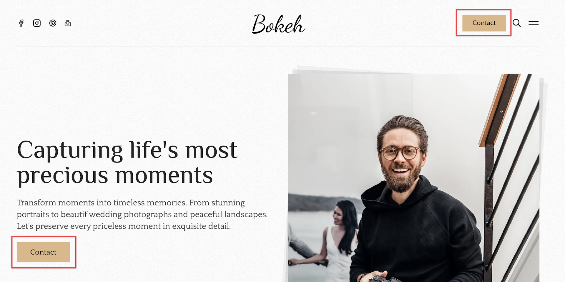
Hero
The hero section is completely customizable from Settings > Design > Homepage, with the following options:
-
Hero headline - the hero section title
-
Hero description - the hero section description
- here you can also use HTML elements like links, bold text, etc:
-
Hero image format - the hero section image format
- the image can be square, portrait, landscape, or auto
Additionally, the Header CTA button text and Header CTA button link settings (Site-wide), will be rendered under the hero description.
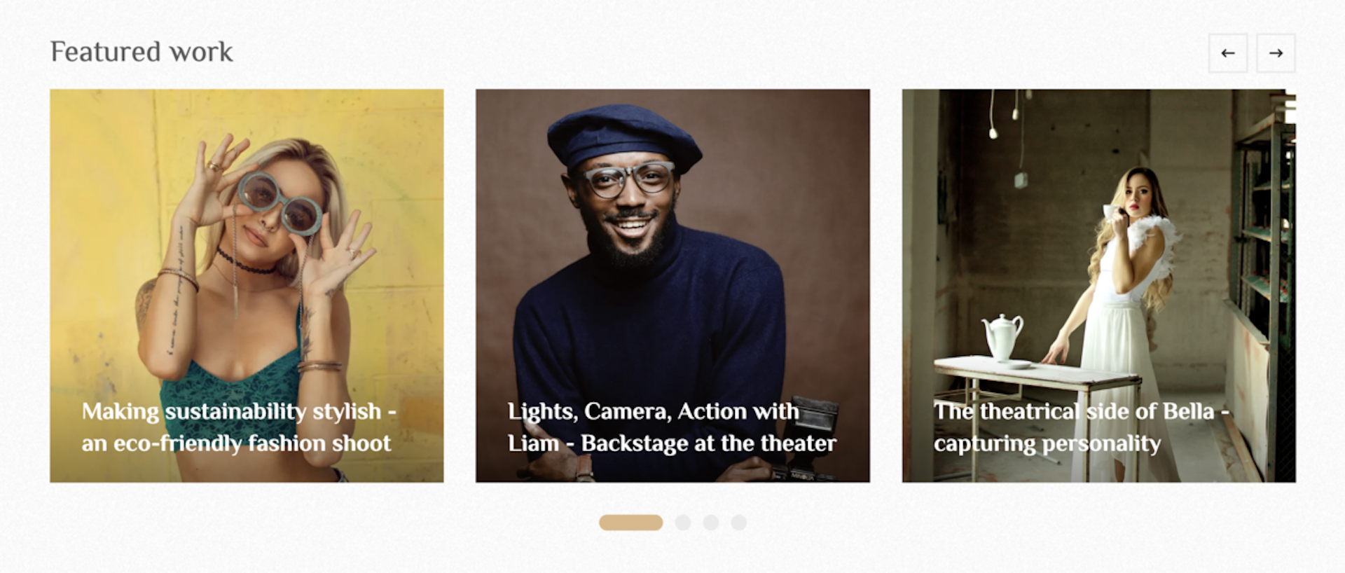
Featured posts
To enable or disable the featured posts slider, go to Settings > Design & Branding > Homepage. Click the Featured posts section toggle button.
The featured posts section markup is implemented in the partials/feauted-posts.hbs file.
The slider function is using the Glidejs library.
By default, all featured posts are fetched and rendered within the slider. Navigating through the list of posts is possible either using the arrows in the top right corner, or the bullet navigation below the slider.
Featured tags
To showcase specific tags on the homepage, you have to set the Featured tags from Settings > Design & Branding > Homepage.
Caution
Important: use the tag slugs separated by commas, and no spaces.
Example from the demo:
portrait,wedding,fashion,nature
Note
You can find the slug of a tag in your Admin > Tags, opening a specific tag and check the Slug field.
There is a second setting, for controlling how the tag is rendered, called Featured tags style. It comes with two options:
- cards - this option will render tag cards, with a link to the individual tag pages. You can see it live on the demo.
- sections - this option will render an entire section for each tag with up to 3 posts. You can see it live on the demo.
Post feed
The post feed displays the articles ordered by the published date, starting with the most recent posts. The layout and design of the post feed can be set from Settings > Design > Homepage > Post feed style with the following options:
- 1-column - each article occupies the full-width available. Demo ->
- 2-column - articles are rendered in a 2-column grid. Demo ->
- 3-column - articles are rendered in a 3-column grid. Demo ->
- 4-column - articles are rendered in a 4-column grid.
- bento-grid - articles are rendered in a 2-column bento style grid. Demo ->
The post cards can also be customized, see the section below for details.
Post card
The post card markup is defined in partials/post-card.hbs file, with some settings
you can do from Settings > Design > Homepage.
- Post card image aspect ratio - the following options are available:
16/9aspect ratio4/3aspect ratio3/2aspect ratio1/1aspect ratio2/3aspect ratio3/4aspect ratioauto- the uploaded image aspect ratio will be respected
- Post card content - set the appearance of the content (title) in post cards, with the following options:
overlay- show the title on top of the image (with a darkened background)stacked- show the title below the imageoverlay-on-hover- don't show the title by default, only show it on top of the image when you hover over the card
- Post card show tags - show/hide the tags on the post card
CTA section
To create the CTA section above the footer, follow the steps below:
- Go to Admin > Pages and create a new page
- Add the internal tag
#ctato the page (must start with#and the slug of the tag must behash-cta) - Upload a featured image which will be rendered on the left side.
- Add your content, including, text, buttons, links.
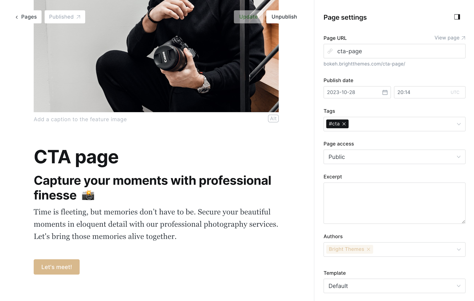
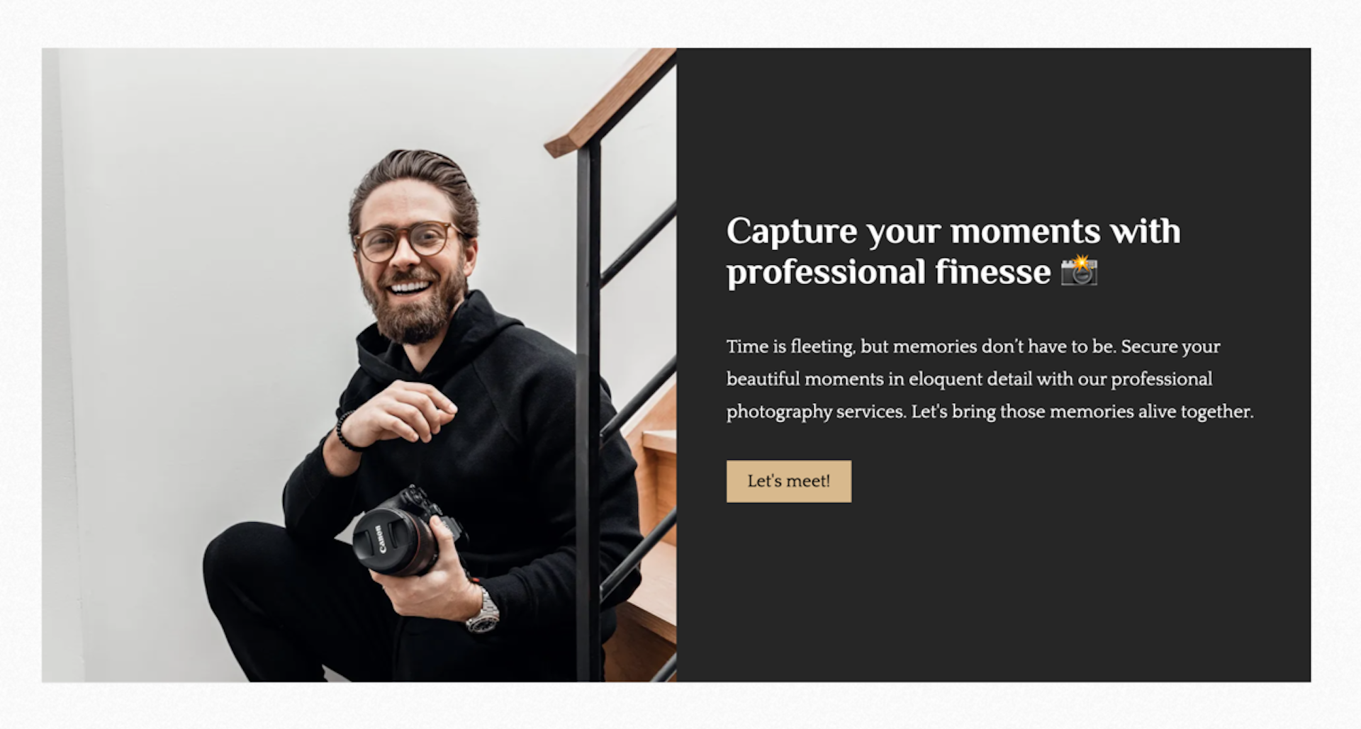
Note
The CTA section, when set up, will be displayed on every page, and regardless of member status.
Custom Pages
As explained in the routes setup, the theme comes with a couple of custom pages, to activate these pages, there are some actions you have to take.
Caution
Uploading the routes.yaml file is a key requirement for these custom pages.
By default, that is the only requirement, but if you want even more control over
the pages then you should activate the data property (remove the # symbol in front of the data property in the routes.yaml file)
and create the page with the correct slug.
To create a Page:
- Log in to your publication admin section at
yoursite.com/ghost/ - Go to Pages (
yoursite.com/ghost/#/pages/) - Click New page and set the Title and Page URL
- Finally, click Publish
Note
The data property can be used to make templates dynamic that otherwise would be static.
Tags
Defined by the tags.hbs template, renders all tags in card format.
If you want to control the meta properties for this page, you have to activate the
data property, by removing the # symbol in the routes.yaml file.
/tags/:
  template: tags
  # data: page.tags # When active data will be taken from the  "/tags/" page
If you activated the data property, you also have to create the page with the tags slug.
Recommendations
Defined by the recommendations.hbs template.
If you want to control the meta properties for this page, you have to activate the
data property, by removing the # symbol in the routes.yaml file.
/recommendations/:
  template: recommend
  # data: page.recommendations # When active data will be taken from the  "/recommendations/" page
If you activated the data property, you also have to create the page with the recommendations slug.
Custom templates
The theme comes with several custom templates, which can be selected for individual posts from the Post Settings menu.
You can choose from the following templates:
custom-with-auto-image.hbs- a template where the feature image kis displayed in it's original aspect ratiocustom-with-landscape-image.hbs- a template where the feature image is rendered in3/2aspect ratiocustom-with-portrait-image.hbs- a template where the feature image is rendered in3/4aspect ratiocustom-with-square-image.hbs- a template where the feature image is rendered in1/1aspect ratio
To set the default post template, go to Settings > Design > Post and set the Default post template value, with the template you prefer.
Note
If you want to edit the templates these are in the root directory of the theme.
Color customization
You can change the main accent color from Settings > Design > Brand. The most important CSS configurations of the theme are defined as custom CSS properties, so you can easily overwrite them from Code Injection to change background colors, text colors, and more.
The theme comes with several color schemes, the default one can be set in the admin using the Default color scheme in Settings > Design > Site-Wide.
The included color schemes:
- system
- light
- dark
- wood
- orchid
- mint
- midnight
The default option is system which will be either the dark or light theme,
depending on the user's preference.
It's possible to change the color schemes by changing the properties. This can be done by adding the following in Code Injection and adjusting the values.
To change the light theme:
<style>
  :root {
    --color-typography: hsl(0 0% 15%);
    --color-typography-tone: hsl(0 0% 30%);
    --color-typography-reverse: hsl(0 0% 85%);
    --color-background: hsl(0 0% 100%);
    --color-background-tone: hsl(0 0% 98%);
    --color-background-reverse: hsl(0 0% 12%);
    --color-border: hsl(0 0% 92%);
    --color-border-reverse: hsl(0 0% 20%);
  }
</style>
To change the dark theme:
<style>
  html[data-color-scheme="dark"] {
    --color-typography: hsl(0 0% 85%);
    --color-typography-tone: hsl(0 0% 70%);
    --color-typography-reverse: hsl(0 0% 15%);
    --color-background: hsl(0 0% 12%);
    --color-background-tone: hsl(0 0% 15%);
    --color-background-reverse: hsl(0 0% 98%);
    --color-border: hsl(0 0% 20%);
    --color-border-reverse: hsl(0 0% 92%);
  }
</style>
To change the wood theme:
<style>
  [data-color-scheme="wood"]:root {
    --color-typography: hsl(33 60% 15%);
    --color-typography-tone: hsl(33 60% 25%);
    --color-typography-reverse: hsl(33 60% 90%);
    --color-background: hsl(33 60% 80%);
    --color-background-tone: hsl(33 60% 75%);
    --color-background-reverse: hsl(33 60% 10%);
    --color-border: hsl(33 60% 70%);
    --color-border-reverse: hsl(33 60% 30%);
  }
</style>
Some useful tools for choosing colors and gradients:
Fonts
Note
You can use Ghost custom fonts to set the heading and body fonts for your site. This can be done from Settings > Design > Brand > Typography.
The theme comes with some additional fonts you can use, for this you have to set the Theme default option in the Ghost custom font settings.
For fonts that are not covered by Admin (for example @font-face files in the theme or CSS via Code Injection), the walkthrough custom fonts in Ghost matches how most Bright Themes handle typography in code.
You can set the font family from the Admin section, going to Settings > Design > Site-wide. There are two options, one for the headings and another for the rest of the elements:
Heading font options:
- System - loads the system font (no requests to Google Fonts)
- Inter
- Cinzel
- Cormorant
- DM Serif Display
- Philosopher - the default option
- Playfair Display
- Abril Fatface
- DM Sans
- Lexend
- Inconsolata
Body font options:
- System
- Inter
- Lato
- Lora
- Inconsolata
- Quattrocento
Tip
With the System font option, you can avoid requests to the Google servers in case GDPR is a concern.
If you still want to use Google fonts and want to self-host the font files check out this guide for self-hosting Google Fonts.
Dropdown menus
bokeh comes with a custom feature to create
dropdown menus easily for your header navigation. All you have to do is add the
minus sign (-) in front of the items in Settings > Navigation
Items having the - sign will be added as subitems to the previous navigation item.
For example:
Ghost config
Some configurations in Ghost themes can be defined in the package.json file, including
Posts per page, Image sizes, and Custom settings.
Posts per page
The posts_per_page defines the number of posts that appear in your collections until it's paginated.
For example, the value of posts_per_page is used on the home page, tag, and author templates.
You can change it in the package.json file:
"config": {
  "posts_per_page": 12
}
Image sizes
Ghost can handle responsive image sizes,
and this is defined in the package.json file, under the image_sizes property.
You can change the default configuration by editing this file before uploading the theme.
"image_sizes": {
  "xxs": {
    "width": 30
  },
  "xs": {
    "width": 100
  },
  "s": {
    "width": 320
  },
  "m": {
    "width": 640
  },
  "l": {
    "width": 960
  },
  "xl": {
    "width": 1280
  },
  "xxl": {
    "width": 2000
  }
}
The sizes defined will be used to generate copies of images at the specified sizes when uploading images in your Ghost Admin.
Comments
The theme uses the native Ghost comment feature. The Native Comment System requires at least Ghost v5.9.0, you have to enable it from Settings > Membership > Access > Commenting.
Here are the options you can choose from:
All members- Logged-in membersPaid-members only- Only logged-in members with an active subscriptionNobody- Disable commenting completely
Icons
The icons used in the theme are from Tabler Icons, the library consists of 5000+ icons.
Only the icons used in the theme are included in the partials/icons directory
in separate .hbs files.
Here are the steps to add new icons:
- Go to Tabler Icons and click on the Icon you want to add, this will copy the code to your clipboard.
- Go into the
partials/iconsdirectory and create a new file:your-icon.hbs - Open the new file and paste the copied code from the clipboard.
- Save the file.
For using the icons inside the theme files, there is a special partial file
partials/icon.hbs which accepts name and size as parameters.
Let's see an example and try to add a new icon. Assuming we want to add the icon
camera and by clicking on the icon on the website, we get this code:
<svg xmlns="http://www.w3.org/2000/svg" class="icon icon-tabler icon-tabler-camera" width="24" height="24" viewBox="0 0 24 24" strokeWidth="1.5" stroke="#2c3e50" fill="none" strokeLinecap="round" strokeLinejoin="round">
  <path stroke="none" d="M0 0h24v24H0z" fill="none"/>
  <path d="M5 7h1a2 2 0 0 0 2 -2a1 1 0 0 1 1 -1h6a1 1 0 0 1 1 1a2 2 0 0 0 2 2h1a2 2 0 0 1 2 2v9a2 2 0 0 1 -2 2h-14a2 2 0 0 1 -2 -2v-9a2 2 0 0 1 2 -2" />
  <circle cx="12" cy="13" r="3" />
</svg>
The next step is to create a new file: partials/icons/camera.hbs and paste the copied code in the file.
The new file must be of .hbs type, so we can use it into the theme files:
{{>icon name="camera"}}
Social links
Social links are shown in the header and footer and by default. The basic social links that Ghost comes with can be edited from Settings > General settings > Social accounts:
- X(Twitter)
For adding other social links you have two options (either one will work):
- Edit the
partials/social-links.hbsfile.
There are several other links in there already, you just have to uncomment
the relevant parts and add your link in the href attribute.
- Create a page with slug:
socials.
In this page create a new HTML card and add your links using <a> tags.
Here's an example from the demo:
<a href="https://facebook.com" class="hover:text-brand" aria-label="Facebook">
  <svg xmlns="http://www.w3.org/2000/svg" class="w-5 h-5 stroke-2 icon icon-tabler icon-tabler-brand-facebook" width="24" height="24" viewBox="0 0 24 24" stroke-width="1.5" stroke="currentColor" fill="none" stroke-linecap="round" stroke-linejoin="round">
    <path stroke="none" d="M0 0h24v24H0z" fill="none"></path>
    <path d="M7 10v4h3v7h4v-7h3l1 -4h-4v-2a1 1 0 0 1 1 -1h3v-4h-3a5 5 0 0 0 -5 5v2h-3"></path>
  </svg>
</a>

<a href="https://instagram.com" class="hover:text-brand" aria-label="Instagram">
  <svg xmlns="http://www.w3.org/2000/svg" class="w-6 h-6 stroke-2 icon icon-tabler icon-tabler-brand-instagram" width="24" height="24" viewBox="0 0 24 24" stroke-width="1.5" stroke="currentColor" fill="none" stroke-linecap="round" stroke-linejoin="round">
    <path stroke="none" d="M0 0h24v24H0z" fill="none"></path>
    <path d="M4 4m0 4a4 4 0 0 1 4 -4h8a4 4 0 0 1 4 4v8a4 4 0 0 1 -4 4h-8a4 4 0 0 1 -4 -4z"></path>
    <path d="M12 12m-3 0a3 3 0 1 0 6 0a3 3 0 1 0 -6 0"></path>
    <path d="M16.5 7.5l0 .01"></path>
  </svg>
</a>

<a href="https://pinterest.com" class="hover:text-brand" aria-label="Pinterest">
  <svg xmlns="http://www.w3.org/2000/svg" class="w-5 h-5 stroke-2 icon icon-tabler icon-tabler-brand-pinterest" width="24" height="24" viewBox="0 0 24 24" stroke-width="1.5" stroke="currentColor" fill="none" stroke-linecap="round" stroke-linejoin="round">
    <path stroke="none" d="M0 0h24v24H0z" fill="none"></path>
    <path d="M8 20l4 -9"></path>
    <path d="M10.7 14c.437 1.263 1.43 2 2.55 2c2.071 0 3.75 -1.554 3.75 -4a5 5 0 1 0 -9.7 1.7"></path>
    <path d="M12 12m-9 0a9 9 0 1 0 18 0a9 9 0 1 0 -18 0"></path>
  </svg>
</a>

<a href="https://unsplash.com" class="hover:text-brand" aria-label="Unsplash">
  <svg xmlns="http://www.w3.org/2000/svg" class="w-5 h-5 stroke-2 icon icon-tabler icon-tabler-brand-unsplash" width="24" height="24" viewBox="0 0 24 24" stroke-width="1.5" stroke="currentColor" fill="none" stroke-linecap="round" stroke-linejoin="round">
    <path stroke="none" d="M0 0h24v24H0z" fill="none"></path>
    <path d="M4 11h5v4h6v-4h5v9h-16zm5 -7h6v4h-6z"></path>
  </svg>
</a>
Note
Icons are from Tabler Icons.
Social sharing
Social sharing is part of the post layout and the following is included:
- X(Twitter)
- Bluesky
- Copy to clipboard
To add other social sharing options you need to edit the partials/social-share.hbs file.
Translations
By default, everything is in English (en.json), additionally, the theme comes with translations in:
- 🇩🇪 German (
de.json) - 🇪🇸 Spanish (
es.json) - 🇫🇷 French (
fr.json) - 🇮🇹 Italian (
it.json) - 🇳🇱 Dutch (
nl.json) - 🇵🇹 Portuguese (
pt.json)
Note
For a translation to apply, you have to set the language in Settings > General Settings > Publication language.
If you want to edit the translation in a specific language, you have to edit the corresponding translation file.
The files are stored in the locales directory (inside the theme zip).
|__ locales
|   |__ de.json
|   |__ en.json
|   |__ es.json
|   |__ fr.json
If the language file for your language doesn't exist, you have to create it (make sure to use the correct language code)
The best way is to copy the content en.json file in your new language file, then change the translations.
Theme development
If you want to make more advanced changes to the theme, or you want to implement your own components, you can take advantage of the developer-friendly setup of the theme.
All the assets are combined and minified for better speed and performance. To customize the theme make sure you have Node.js installed.
The theme is built with TailwindCSS and Alpine.js. The development environment is based on Vite, the tasks can ran with npm scripts.
This guide is assuming that you have installed Ghost locally.
Add the theme directory inside Ghost's content/themes/ directory then move to the
theme directory in your command line. Run the npm install command to install all
the dependencies.
After that is done, you have access to run the npm scripts:
-
npm run dev(vite build --watch & vite) The dev script will start the development process, watching for changes and building. Thevite.config.jsfile contains the main configuration for Vite. -
npm run build(vite build) The build script will start the build process. -
npm run test(gscan . --verbose) The test will test the theme using gscan the official Ghost test tool. -
npm run zipThe zip script will create a zip file in thedistdirectory.