Accordions are on almost all websites in one shape or form, as it's a great way to create an FAQ section or collapsible sections of text in your posts and pages.
There are advantages to using accordions to long, content-rich pages:
- Collapsing the page minimizes scrolling.
- The headings serve as a mini-IA of the page. This allows users to form a mental model of the information available.
- Hiding some of the content can make the web page appear less daunting.
- It’s a useful pattern for progressive disclosure — highlighting important details of a section and revealing more details upon a tap or click if wanted.
There are many ways to implement such a feature, usually involving Javascript,
but in this article, we will explore the <details> & <summary> elements that
work in browsers out of the box.
The accordion markup
The <details> element creates a disclosure widget in which information is visible
only when the widget is toggled into an "open" state. A summary or label must be
provided using the <summary> element.
The <summary> element specifies a summary, caption, or legend for a <details>
element's disclosure box. Clicking the <summary> element toggles the state of
the parent <details> element open and closed.
Now that we have the basics, let's create an HTML card in the editor, and create the markup. Here is the code that you can paste directly in the HTML card:
<details class="accordion">
  <summary>When will payments begin?</summary>
  <p>
    When we receive your agreement, we send you a letter or email confirming the
    original terms of your agreement. This includes your payment amount, balance
    due, and date your authorized payments begin. Payments will continue until
    the total balance is paid in full.
  </p>
</details>

<details class="accordion" style="--color-accent: royalblue;">
  <summary>I forgot my username/password. How do I login?</summary>
  <p>
    To retrieve your username or password, visit this link. If you've forgotten
    your username, it will be sent to the email address associated with your
    account. If you’ve forgotten your password, a link will be emailed to the
    email address associated with your account that allows you to reset your
    password.
  </p>
</details>

<details class="accordion" style="--color-accent: aquamarine;">
  <summary>How do I upgrade, downgrade, or cancel a subscription?</summary>
  <p>
    We offer yearly and monthly plans, which you can read more about on our
    Pricing page. All our plans are recurring, and if you want to unsubscribe
    you should cancel your plan before your prepaid period ends (term end). You
    can cancel your subscription under the Account section on the Plan & billing
    page.
  </p>
</details>
The accordion style
Let's start styling our accordions. In our case, we will change the default triangle icon to something different as well as change the background color to give more personality to our accordions.
You can add this in Code Injection in the Ghost Admin:
details.accordion {
  --color-accent: #222;
  margin-bottom: 1em;
  border-radius: 5px;
  padding: 1.5em;
  position: relative;
  padding-left: 3.5em;
  border-left: 5px solid var(--color-accent);
  overflow: hidden;
}

details.accordion::before {
  background-color: var(--color-accent);
  opacity: 0.1;
  content: '';
  position: absolute;
  width: 100%;
  height: 100%;
  top: 0;
  left: 0;
}

details.accordion summary {
  list-style: none;
}

details.accordion summary::marker {
  display: none;
}

details.accordion summary::before {
  position: absolute;
  content: '+';
  left: 1.5rem;
  top: 1.35rem;
  color: #000;
  font-size: 1.6rem;
  line-height: 1;
  font-weight: normal;
}

details.accordion[open] summary::before {
  transform: rotate(45deg);
}

details.accordion[open] summary {
  font-weight: 700;
}
The result
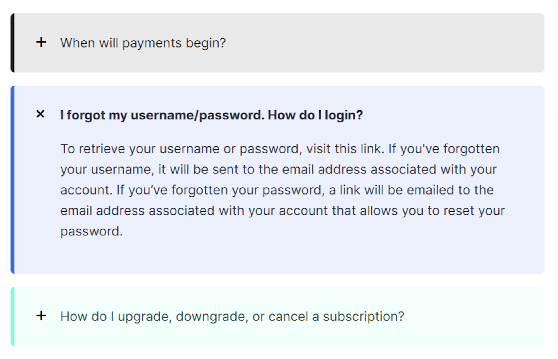
Here is the final look of the accordions:

You can change the color of the accordions, by changing the value of the --color-accent
property on the first row of each details HTML element, if you don't specify a color
the default black will be used, like for the first element in the code example.
Creating a snippet out of the markup will make it easy to include it anywhere in your posts.