Subscription forms are an essential part of Ghost, especially with the membership feature, allowing you to grow an email or member list. On self-hosted sites, member and newsletter mail almost always depends on SMTP first—if that is not set up yet, work through configuring Ghost with Mailgun before you tune forms. Most themes ship with subscription forms already; here we focus on how to customize them and how to drop them into posts.
Basic subscription form and options
The most basic sign up form looks like this:
<form data-members-form>
  <input data-members-email type="email" required="true" />
  <button type="submit">Continue</button>
</form>
The data-members-form attribute on the form element, tells Ghost to handle the submit event. The input field for the email is required as well as the submit button.
The data-members-form attribute has 3 possible (optional) values:
signin– to send a sign in email to an existing member, if the member doesn't exist a sign up email is sent instead.signup– to send a sign up email to new members. If the provided email is already a member, a sign in email is sent instead.subscribe– to send a subscribe email. If the provided email is already a member, a sign in email is sent instead.
When the submit button is pressed, the form can have different states, which are written to the form class:
loading- when the submission is loadingsuccess- when the submission was successfulerror- when the submission ended in error
Create forms for your hbs templates
If you want to create forms in your theme, you will need to edit the template files. You might want to add a subscription form to the sidebar, the footer, or in a popup. The basic form can be used with some additional elements to also provide feedback to the users.
Here is a form for collecting names and email addresses, and also handling error/success messages.
<form class="subscription-form" data-members-form="signup">
  <input data-members-name type="text" placeholder="name" required />
  <input data-members-email type="email" placeholder="email" required />
  <button class="btn" type="submit">Singup</button>
  <div class="success-message">Great! Check your inbox and click the link.</div>
  <div class="error-message">
    Sorry, something went wrong. Please try again.
  </div>
</form>
Of course, some CSS is needed to style this and also make the messages appear when the form class changes. Here is some basic CSS styling for the form, which you can add via Code Injection:
.subscription-form {
  display: flex;
  flex-direction: column;
  width: 100%;
  max-width: 30rem;
}

.subscription-form input,
.subscription-form button {
  padding: 10px;
  border-radius: 5px;
  box-shadow: none;
  border: 1px solid #cecece;
  margin-bottom: 1em;
}

.subscription-form .success-message,
.subscription-form .error-message {
  display: none;
}

.subscription-form.error .error-message,
.subscription-form.success .success-message {
  display: block;
}

.subscription-box {
  background-color: lightyellow;
  padding: 2em;
  display: flex;
  align-items: center;
  justify-content: center;
  width: 100%;
  border-radius: 5px;
}
As explained earlier, you can change the default behavior of the form to be either subscribe, sign up or sign in.
If you are into hbs you can even create a partial with some parameters such as form_type, button_text, and more to make the form reusable for different purposes.
Member subscription form for your posts
If you don't want to modify your theme, you can still use and implement the form via HTML cards in any post. Go to your Admin and open a post you
This is quite basic, and you might want to add some styling to it. It's a good idea to add a wrapper around the form and with a background color and padding, we can make it more appealing.
<div class="subscription-box">
  <h3>Susbscribe now</h3>
  <form class="subscription-form" data-members-form="signup">
    <input data-members-name type="text" placeholder="name" required />
    <input data-members-email type="email" placeholder="email" required />
    <button class="btn" type="submit">Singup</button>
    <div class="success-message">
      Great! Check your inbox and click the link.
    </div>
    <div class="error-message">
      Sorry, something went wrong. Please try again.
    </div>
  </form>
</div>
Besides the previous CSS code, you can add the following to style the box and how the form is placed inside of it:
.subscription-box {
  width: 100%;
  display: flex;
  flex-direction: column;
  align-items: center;
  justify-content: center;
  padding: 2em;
  background-color: palegreen;
  border-radius: 5px;
}
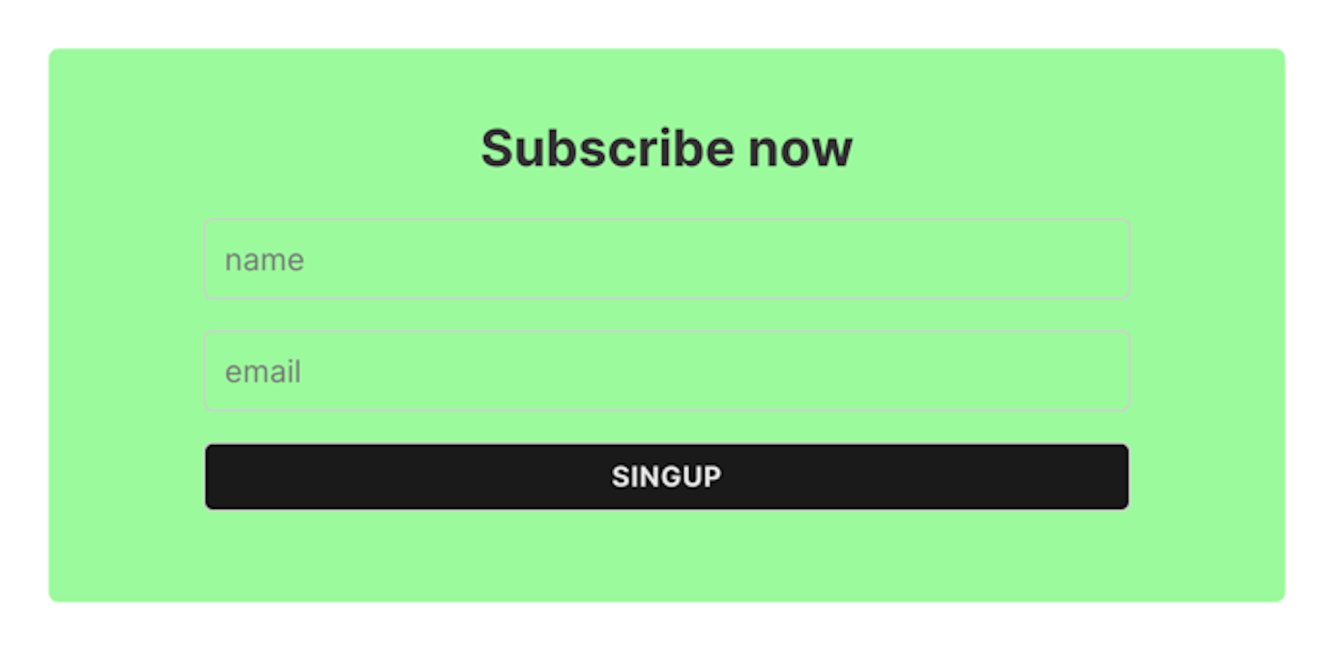
Here is the result (depending on your CSS this might differ):

To make it reusable, you can create a snippet from the HTML card, and simply insert it anywhere you want to in your posts.